Email marketing begins with the opt-in box. It’s where subscribers sign up and also where you set their expectations for the entire time they’ll be your subscribers. With so much power in that little box, it’s also an ideal thing to test. To help you make the most of your email opt-in forms, we’ve rounded up 10 excellent A/B opt-in form split tests, with results, so you can get a head start toward higher opt-in rates and a larger email list.
It’s an especially great time for testing opt-in forms if you’re a GetResponse customer. Our new forms feature lets you do a slew of things that weren’t possible before. Stuff like:
- Creating exit opt-in forms, overlay opt-in forms, “shake” opt-in forms, sliders and more.
- More intuitive flexible editing of forms with extensive control of color, font and size. There’s even an HTML code editor if you want to add your own code.
- Split-test your opt-in forms. Up to 8 variations!
Want to use GetResponse Forms and Popups? You can create your first free popup today:
Fortunately, the new forms are easy enough that you could even skip that tutorial and just jump in. It’s up to you. But we are going to jump into this list of split-tests. Right now:
1) Put your opt-in box above the fold.
 |  |
| Opt-in box below the scroll line | Opt-in box above the scroll line |
Just moving an opt-in box from below the scroll line to above it resulted in a 30% increase in email signups in this test. There was also no drop-off in sales as a result of the change.
One caveat about this test, though… While I hate to confuse you, there’s another popular test that found the exact opposite thing. It brings up a critical issue around testing.
Here’s what Content Verve discovered when they ran a test of where to put the opt-in form:

So what does this mean? Are all tests baloney?
Well, they’re not baloney, but they definitely aren’t gospel either. Enjoy all these A/B tests as interesting and educational entertainment. They might even be worth testing yourself.
But remember that tests can often go either way. You always have to test for yourself – for your audience and for your website. And always use proper testing methodology. That means not picking a winner until you’ve got statistically valid test results and you’ve been running the test for at least a week.
2) Consider offer content bundles, instead of a single piece of content.
We’ve got several tests about content upgrades, and this is just the first. For you newbies, content upgrades are where you offer an expanded version of the content that’s on the page. So something like a free report or a checklist at the close of a blog post.
Typically content upgrades offer just one piece of content. But they don’t have to stop there. Consider this: the content upgrade right below, on CoSchedule’s blog got a 3.38% opt-in rate:

But this got a 6.08% opt-in rate:

That’s almost double the opt-in rate!
Take note that how often you show the opt-in box matters, too. CoSchedule shows that new pop-up only once every 5 days.
3) Use an image in your opt-in form.
The World Wildlife Fund wanted to increase email opt-ins on a key form. Here’s what they had originally:

They simplified the form just a little, but the biggest change was adding an image – a screenshot of their email newsletter.
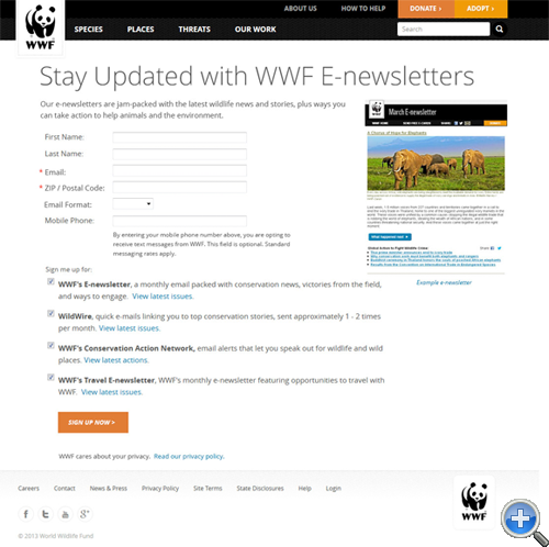
Caption: Images from WhichTestWon.com.
That new version boosted sign-ups by 83%! That’s a terrific lift for just adding one image.
4) Offer a “content upgrade”.
While they are proven to work, many marketers and blogger hold off on creating content upgrades because they’re so much work. I hope this test will give you incentive to push through the extra work – the results are really worth it.
Brian Dean of Backlinko had been getting a 54% conversion rate for signups on a blog post page.
After reading about how well content upgrades worked, he decided to add a content upgrade by inserting links at the top and bottom of the page. Those links prompted people to download a checklist.

And he got his result: a new 4.82% conversion rate the same day. That’s a 785% increase in opt-ins.

There’s a similar case study of an upgrade like this getting a 492% increase in opt-ins here. Which brings us to the next interesting split test.
5) Promote your content upgrade at the top AND at the bottom of every page.
Devesh Khanal was analyzing content upgrades on Brian Dean’s site, Backlinko. He noticed wide variations in how well different pages converted.
Upon closer inspection, all the pages had a content upgrade at the bottom of the post. But the pages that were really converting ALSO had a content upgrade at the top of the post.
So Devesh compared the two groups – pages without the top content upgrade promo versus pages with it. The pages with it converted at 3.8%. Pages without it – with the content upgrade promoted only at the bottom – converted 1.2%. That’s a 315% improvement just for adding a few links to the top of the page.
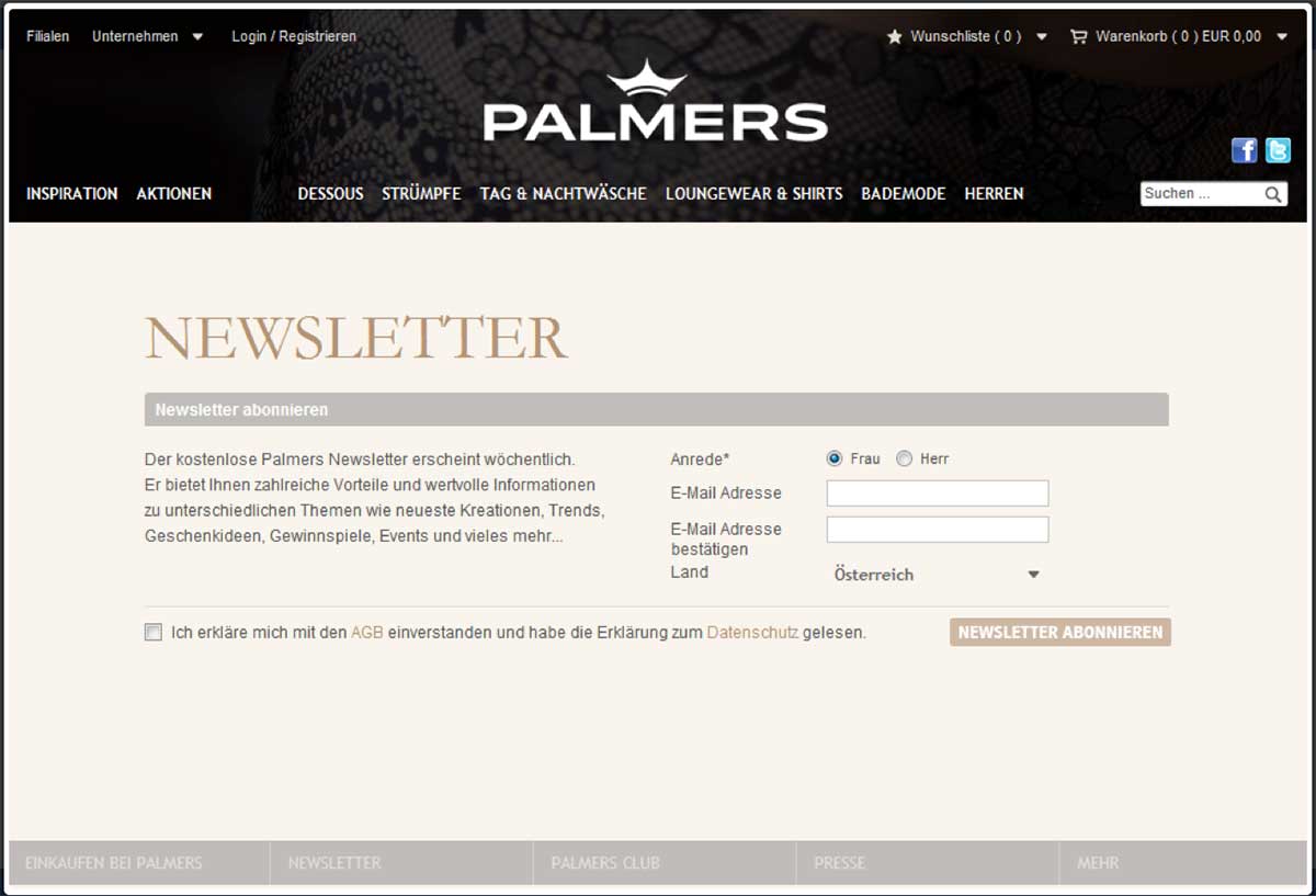
6) Use an overlay or an embedded sign up form, not an opt-in page.
The ecommerce site Palmers (https://whichtestwon.com/case-study/palmers-overlay-test-results/) wanted to know if an overlay could beat their opt-in page. Boy, did it. By 573%.
Here’s the original opt-in page:
Here’s the pop-up/overlay:

The overlay got 573% more leads without reducing sales. Nyce.
The key takeaway here is to avoid sending people to an opt-in page where you can. Try using an embedded opt-in form instead.
7) Use a little extra prompting where you can.
Pushy marketing has its rewards. Sure, you may get accused of being rude, but you’ll also probably get more email subscribers. Lots more email subscribers.
This test was done for an online retailer that sells women’s clothes, WomanWithin.com. It won the Gold award in the Email List Gathering Category of Which Test Won’s 2015 Email & Mobile Testing Awards. Here, a “behavioral annotation” (aka a pushy call to action) got a whopping 473% more subscribers than the unadorned and more modest version.
Here’s the plain jane opt-in:

Here’s the pushy, in-your-face winner:

8) Say something more specific than “Sign up” or “Subscribe” on the opt-in button.
This is really old advice, but the conversion optimization company ContentVerve proved it all over again when they tested the opt-in forms for BettingExpert. It’s a good lesson in why opt-in button copy is so valuable.

Caption: From Content Verve’s ebook, 7 Universal Conversion Optimization Principles.
There’s another similar button test in their ebook, 7 Universal Conversion Optimization Principles. They found that using “my” (as in “Start my 30-day free trial”) instead of “your” bumped click-through rate on a form by 90%.
So don’t just rush through and leave the button copy with the default “Submit” or “Subscribe”. You could cost yourself a lot of subscribers.
9) Be specific about what subscribers are going to get.
The opt-in box sets up a lot of expectations for your newsletter. Being specific about what people will get gives them more confidence that signing up is a good idea. So considering including bullet points that describe:
- How often they’ll get the updates (Weekly? Daily?)
- Who the updates are for (Single moms? Rock climbers? Cat lovers?)
- What the updates include (Video tutorials? Articles?)
This is another test from Content Verse test vault. It demonstrates the power of a little descriptive copy.

10) Keep form fields to a minimum.
Have you heard about how every time you add another field to an opt-in form, you reduce the conversion rate? It’s true. Marketing Experiments has a great SlideShare about three different split-tests they did on long versus short opt-in forms. In every test, the shorter forms won.
How to set up an A/B split test with the new GetResponse forms
I can’t show you all these cool tests without showing you how to set up your own. So here’s how:
1) From your account Dashboard, go to the “Forms” link in the upper navigation.
2) Choose “Create Form Beta”.

3) You’ll see the new Forms interface. Choose any one of 500 opt-in forms to edit.

4) After you’ve clicked on the form you want to edit, you’ll be in the edit view, which looks like this:

5) Make your changes to the form, click the blue “Save” button in the upper right hand corner (just in case…), then click the plus sign in the upper left-hand corner of the page. This will add a new “variant” or variation to your split test.
While you can have up to eight variations of a test, be careful with that. You need a significant amount of traffic to get statistically valid results. It’s too complex a formula to give you an offhand estimate for how much traffic your tests will need, but let’s just say that fewer test variations are usually better.

6) Clicking the plus sign will bring up a fresh new version of the same default opt-in box for you to edit. When you’re done making changes to the second version, click the blue button with option “Save and Publish”.
You can follow the instructions after that to either add the javascript code to your site yourself, or to send instructions for how to add it to a site to your web designer.
7) Once the form is installed and has been running for awhile, go back to the top line of navigation and click “Manage Forms Beta”. You’ll see something like this:

If you click on the icon of the test tubes, where the blue link reads “A/B Test”, you’ll see the variations of your opt-in form and the results for them so far.

High opt-in rates aren’t everything
It’s awesome to see opt-in rates spike by over 100%, or even by a little. But don’t get too consumed by what you see on the front end.
A new opt-in form could boost your opt-in rate, only to give you subscribers that aren’t worth as much as your ones are. In other words, don’t do anything just to get more email opt-ins. A list that responds to your emails and spends more is worth more, even if they come to you via a lower opt-in rate.
Which would you rather have: a million subscribers who are worth a penny each? Or 1,000 subscribers worth $100 each?
What do you think?
Are you running any split-tests on your opt-in forms? What’s worked – or not worked – for you? Tell us about it in the comments.