Looking for landing page examples to inspire your next lead generation campaigns? Landing pages that not only look good – but most importantly – drive conversions? If you said yes to either of these questions, then you’re in the right place.
In this article, not only will you find some of the best landing page samples, but also, will learn what makes them great.
First, we’ll start with some theory, to make sure we’re on the same page. If you’d rather skip that part and go check out the landing page examples right away, then go ahead and use the table of contents below.
What are landing pages?
A landing page is a page on your website that visitors “land” on after clicking an ad or strategically placed link to drive traffic to the page.
Many business owners use their homepage as a landing page, but that’s usually not the best approach.
That’s because homepages tend to have a lot going on:
- Numerous links
- Company info
- Navigation menu
- Brand positioning
Having this many elements is okay for a homepage because it targets a broad range of prospects. But it spells doom to a landing page because it distracts the customers-to-be.

Dedicated campaign landing pages are focused and have fewer diversions. This hikes conversions because visitors are not lured away from the page.
Which brings us to the question – what purpose do landing pages serve?
This article focuses on effective and inspiring landing page examples. If you’d like to learn more about how landing pages work and why they’re valuable in overall marketing strategies instead, read our guide to landing pages.
What is the purpose of a landing page?
The purpose of a landing page is to convert visitors into leads. Most landing pages do so by collecting contact information from your visitors in exchange for some piece of content, e.g. an ebook, report, or a tool.
A well-designed landing page converts visitors into leads by:
- Giving visitors specific information about a product, service or any other offer.
- Directing visitors on the particular steps, they must take to access the offer you’re making.
In this hyper-competitive digital world, converting traffic into customers efficiently is critical.
And that is the main reason you need to direct your traffic to an optimized landing page instead of just your homepage.
Want to learn how to build high-converting landing pages and grow your business faster? Sign up for our free Essential Landing Page Course or read our 9-step guide to creating landing pages today.
Landing page types you need to know
The landing page concept may sound simple, but there’s more to it than meets the eye. For starters, many landing pages serve different purposes. Most fall under two categories:
- Lead generation landing pages. They’re also called lead capture pages or squeeze pages, and they feature a web form. The main purpose of lead generation landing pages is to collect contact information (such as names and email addresses).
Within this category, you may also find other page types, depending on the content they feature. For example: ebook landing pages, webinar landing pages. - Click-through landing pages. Click-through landing pages are not designed to capture visitor information like their counterparts. Instead, they reinforce an action like purchasing a product or signing up for a service or subscription.
Now that you understand what a landing page is let’s look at some of the best landing pages we’ve seen on the web.
15 landing pages examples for you to steal (ethically, of course)
Tired of creating landing pages that barely get you across the marketing finish line?
Then take a cue from businesses that have mastered the science of creating landing pages that convert like gangbusters. And don’t worry, we’ve taken care of all the heavy lifting for you by compiling a list of great landing page examples and explaining the best practices you can take from them.
Let’s get to it.
1. Netflix
With over 150 million subscribers to boast of, Netflix is one brand that has nailed the marketing. And one piece of their marketing machine that has contributed to the massive success is their high-converting landing page.

One of the best aspects of Netflix’s landing page is that it’s minimalistic and yet packs in a lot of information for the reader. How?
- They keep the copy to a minimum. With 12 simple yet compelling words, the landing page sells the service and reassures subscribers that they’ve got nothing to lose by signing up. Sure, you can scroll down the page for more information, but most people don’t. Those 12 words are enough to get them on board.
- Clever use of imagery. If there’s one thing entertainment buffs love, it’s having a wide choice of shows and movies to choose from. Netflix does a great job of showing they’ve got that pat-down by using a background image that shows the popular shows subscribers can look forward to consuming.
- Irresistible CTA. The well-designed and well-placed call-to-action button on this landing page example is hard to resist. It just begs to be clicked.
It’s also interesting to note, that this could have easily been a long-form landing page, but the designers opted to turn it into an easy 3-step journey. With a landing page like this, it’s no wonder Netflix has and continues to grow so fast.
2. Uber
Do you want to use your love for driving to make money? Uber helps you do just that. And if you’re not sure about it, then the landing page will certainly convince you that you can.

Uber’s landing page is another example of less is more. From the simple design to the crisp, clear, and compelling copy, this landing page achieves its goals – getting drivers to sign up.
Speaking of the landing page copy, Uber’s is award-winning as it promises readers 2 of the most sough-after things in life – income and freedom. As for the lead capture form, it’s user-friendly as it has a few easy-to-fill fields, making the process simple and fast.
Other key takeaways from this landing page example include:
- Use language your audience relates to. In Uber’s case, words like “drive” help readers relate to the offer.
- Relevant images bolster your message. Use images that help visitors to your landing page picture themselves using your product/service.
Uber’s landing page example is one you’ll do well to emulate. As simple as it looks, it’s very effective.
3. CoSchedule
If there’s one thing marketers struggle with, it’s keeping all the moving pieces of their campaigns in one place.
That’s where CoSchedule comes in.

Three important things to note from this landing page are:
- Hyper-targeted. CoSchedule’s target audience is clear – overwhelmed marketers who want to get their marketing act together. And the landing page copy does an excellent job of addressing their pain points in a way that makes the product look like the hero they’ve been waiting for.
- Headline. A great landing page headline tells you exactly what to expect from the offer and in a way that makes you immediately want to click into it. That’s exactly what CoSchedule’s cleverly crafted headline does.
- Call-to-action. notice how the CTA extends the headline and, ultimately, what Coschedule is offering. This is a brilliant way of reinforcing they have the solution their audience is looking for.
Another noteworthy element in this landing page example is the way CoSchedule infused a sense of urgency into the landing page.

By including a time-limited offer, this landing page’s chances of converting increase. This offer does a great job of encouraging those who are not sure to sign up even if it’s just for the book.
This is definitely a landing page worth swiping for more reasons than one.
4. Workable
If you’re looking for one of the best lead generation landing page examples, Workable always build swipe-worthy ones.

Marketers always want to be ahead of the curve when it comes to trends, hence Workable’s minimalistic landing page design. Besides, their audience are super-busy HR managers and recruiters who want to get straight to the point. By understanding their target audience and designing their landing page with their needs in mind, Workable nailed this one.
As for the simple and easy to fill sign-up form, it’s another testament that the team at Workable certainly know what they’re doing – and who they’re doing it for.
Here are a few subtle landing page design cues you can borrow from this landing page:
- Less is more. By employing a minimalistic design, the landing page communicates more about Workable’s philosophy – keeping things simple for you.
- Be benefits-oriented. Most of the copy on the landing page points to the benefits you get from using the platform.
- Employ social media sign-ins. Fill in the form by clicking on one of the social media icons. Again, this makes it easy for busy people.
- Build trust by using testimonials. By including the fact that 96% of GetApp reviewers recommend Workable, readers are inspired to put their faith in the platform.
Lead generation landing pages can be tricky to get right. But with careful planning and inspiration from some of the best landing page examples, you can succeed in building a high-converting one for your business.
5. Trello
Collaborating on a project is never easy – especially when the team has remote members. Trello is one of the best tools on the market to help you overcome this hurdle. And that’s the first pain point they address in their landing page.

One of the best parts about Trello’s landing page is the way the design and all the elements on the page work together to give you a friendly and welcoming feeling. Unlike most landing pages that put readers under pressure to sign up, Trello took a more laid back approach.
A scroll down the page will also reveal a few other strong points:
- User-focused copy. Reading the copy on Trello’s landing page is like talking to a concerned friend. Instead of pushing the product in your face, the copy addresses the challenges you face and points at the benefits of using Trello in overcoming those challenges.
- Mini tutorial. Before taking the plunge to sign up, Trello gives you a mini-tutorial on how to use the service and get the most out of it. This reassures those gripped by technophobia (fear of new technology and advanced devices) that the platform is super easy to use.
One of the best ways to ensure that your landing page converts well is to make it all about your customers. And that’s what makes Trello’s landing page copy a winner.
6. Jacob McMillen
Freelance writer, Jacob McMillen, recently launched a mastermind group with the sole purpose of helping other freelance writers succeed in their copywriting businesses. The landing page for the said group is a great example of an effective long-form landing page.

For one, the color combination and typography was so well-executed the landing page is easy on the eyes (unlike most designs that are loud). As for the copy, he hit the nail on the head by touching on the most common pain points writers face, such as:
- Loneliness
- The struggle to hit 6 figures
- Scaling their businesses
And if there’s one thing a landing page needs to do well, it’s allaying people’s doubts about your product and instil such a sense of trust that they’ll readily take the next step. This landing page example does just that, with social proof from some of the most revered names in writing circles.

Another winning strategy employed on this landing page is that of exclusivity. The bold orange CTA with the words “join the waitlist” hint at the group being exclusive and not for everyone. The result? The FOMO effect, or the fear of missing out, goes into play, driving readers to sign up very fast.
Read more: Thank you page examples and tips
7. GetResponse
The holiday season is one of the busiest times of the year for everyone. But it can be a nightmare for marketers as the competition becomes stiffer with everyone running a promotion of their own.
GetResponse helps marketers get noticed in busy times of the year, as was the case with the Ultimate Marketing Bundle for Black Friday. Below is the landing page for the same offer:

What makes this landing page tick?
For one, it gives a solution to a common pain point. For most marketers, marketing during the holiday season is hard. GetResponse offers a solution to making your vacation marketing easy. This alone is enough to get marketers to click through to the offer.
Scroll down the page and you’ll soon find some other nuggets you can implement on your next landing page. Here’s a good example:

Including a countdown timer is a classic and subtle way of evoking a sense of urgency in the landing page. Seeing how many days are left before the holiday season kicks in is a great way to show visitors they are running out of time to plan and execute their holiday marketing strategy.
Usually, a few marketers may fall behind schedule and feel overwhelmed by all they have to put in place in a short space of time. Well, GetResponse addresses this issue too.

“Let’s do this together”. Nothing is as comforting as knowing that you’re not facing a challenge alone. By including this emotional trigger, GetResponse increases their chances of clickthroughs as people decide based on emotions. Yes, even in B2B circles.
From the design to the copy to the structure of the landing page, this is one landing page example with many lessons to takeaway.
8. SEMrush’s content marathon
Content Marathon is a writing course that aims at turning anyone into an exceptional writer. Hosted by Stewart Rogers of Venture Beat and “guided by” SEMrush and Content Marketing Institute, this is definitely one writing course to invest if you’re a writer.
And the landing page?
It’s definitely a masterpiece!

First off, Stewart’s warm fatherly smile easily disarms the reader and makes them open to whatever he (and the landing page copy) has to say. Use images of real people on your landing page as research shows they boost conversions.
These help:
- Visitors connect easier to your offer. After all, people relate better to people than inanimate objects
- Express the feelings your audience relates to their pain point or the joy of finding a solution

The next piece of genius is how this landing page explains how Content Marathon works and what sets it apart from other writing courses. This is crucial as there are tons of writing courses out there and setting themselves apart is critical if the landing page is to convert well.
Why should you bother investing in this course?

Because 73.4% of employers prefer candidates who have strong writing skills. This strategic placement of this statistic and other reasons for joining the marathon hooks the reader as they show:
- The course is not just a way of getting money from you. instead, its main purpose is to improve your chances of getting employment or making an income.
- Everyone needs to work on their writing skills as long as they want to earn a living – whether self-employed or as an employee.
Scroll down the page you’ll find more information on the course, testimonials from last season’s students, and a lot more. Plus, the page is structured in such a way that it makes the journey to the bottom very gripping. If you’re looking for an example of a well-executed long-form landing page, then this is definitely it.
9. Getdoapp
In the marketing world, pretty much everyone’s stressing about becoming more productive, waking up earlier, and formulating new routines.
As an answer to these trends, numerous apps have emerged, all promising to help you transform your life.
But as you’ve probably experienced yourself, many of them have actually either overcomplicated things or didn’t look compelling enough for you to want to keep coming back to.
Makers of Getdoapp understood that, and not only did they make their app super clean – they also made sure that their landing page reflects that, too.


Here’s what’s particularly good about this landing page:
- The headline matches the visuals. They promise to “Simplify your to-do list,” and the supporting visuals (that show the actual app) couldn’t get any simpler.
- The headline, visuals, and single CTA all fit the above-the-fold section. They’re powerful enough to convert a big chunk of the visitors.
- Excellent copy that proves the brand understands their users’ pains – along with reasons why they may not have been successful with other apps before.
- Overall soothing design – just right amount of information, lots of negative space, thin and aesthetic typography, elegant and simplistic visuals
10. Snappr
If you’ve ever looked for a photographer – whether it was for a wedding or a business event – you know how hard it can be.
Even if your friends recommended you to someone and you happened to like their portfolio, there’s no guarantee that you’ll be satisfied with the photographer’s service.
You can forget about these challenges if you use Snappr.
They’ve made sure to check all the boxes on their great landing page and answer any questions you may have.


Here’s how they’ve done it:
- The headline and the subheading tell you right away what the service is about. The copy is brief and works out great.
- Google rating, the second headline, “Snappr is used by 53% of the Fortune 500 companies”, and the logos all add trust and reinforce the message that the platform’s both a good fit for individuals and businesses.
- A simple three-step section that explains how the process works.
And as you keep scrolling, you find even more gems:
Selected categories – “portrait,” “event,” “real estate,” etc. – provide a shortcut for the (potentially) primary customer personas. They lead you right into the app, where the journey’s personalized based on your category of choice.
Key features – like rough pricing, insurance, fast turnaround – are all highlighted so that you have no reasons to hesitate and hit that CTA button.
More logos, testimonials, and Tweets from big brands – all adding even more social proof and credibility so that once you’ve scrolled to their final heading “What are you waiting for?” you’ve got no other answer than to click the “Book now” call to action.
11. How To Product
It’s not an easy thing to become a product manager.
Sure, there are ways to get yourself educated in product management, but landing your first job within the area is challenging.
So how did others do it? After all, not all product managers made a horizontal shift within the same organization?
If you’ve ever asked yourself this question, then the “How To Product” ebook & landing page have got the answers for you.


The following landing page example includes several impressive elements that make it very practical:
- While the headline may not give away what the ebook is about, the subheading clarifies that this isn’t a list of tips based on a quick Google search. These are 25 stories from present-day product managers from some of the most renowned brands like Google, Shopify, or Coursera.
- Product hunt badge adding credibility and proving that folks around the web have widely appreciated this ebook.
- Testimonials and names of the product managers featured in the ebook provide further proof that this is the real deal, something worth exchanging your email address for.
- Breakdown of chapters and the link to the ebook summary – so that you can make a well-educated decision before downloading the content.
- The author’s story explains who he is, how he understands the struggle of becoming a product manager, and why he’s created this resource.
While this landing page refers to a specific piece of content, the ideas used here can be an inspiration for all campaigns and not just landing pages built to promote ebooks.
12. Zapier
If you’ve ever used automation, you know how intimidating it can be, especially if you’ve never learned to code.
But when you first enter Zapier’s landing page, all of those feelings go away.


They manage to convince you that automation’s not only essential but also something that anyone can do. They achieve this through:
- Copywriting that avoids using buzzwords. They make a promise that they’re going to eliminate repetitive tasks by connecting your apps for you.
- Great visuals that explain how the process works and get you acquainted with what their platform looks like.
- Search bar allowing you to find out whether your favorite apps are available to be connected via Zapier.
- Zap templates that provide use-cases so you can better understand how the platform could benefit you (and save you time, too).
- The ungated demo lets you see what the platform looks like and how it works without scheduling a call with a sales representative or providing your contact details.
- Workflows dropdown that let you search through automations used by folks who have a similar role.
This is an inspiring example that manages to simplify a topic that used to be reserved to more technical people. Probably one of the reasons why the platform’s so widely popular, too.
13. Whereby
How much time do you waste organizing video meetings with your clients or colleagues?
Setting up the room, sending out the invites, waiting for everyone to download the app – that’s ca. 5 minutes, and sometimes you’ve only managed to get a 30-minute slot in everyone’s calendar.
Luckily, there’s Whereby, which solves these problems and communicates this clearly through their impressive landing page.


Here’s what stands out about it:
- The benefit-oriented copy speaks to users’ problems – the time it usually takes to organize meetings, apps you have to download, etc.
- Animated visuals that show you what the meeting app looks like.
- Copy that overcomes fears regarding privacy and complicated setup.
- Numerous trust signals, including G2 reviews and logos of renowned brands like GE, Trello, or Miro
- Visuals showing people who seem genuinely happy, suggesting that meetings over Whereby can be enjoyable.
Finally, what’s also good is that all essential features are highlighted on the main page. There is no need to spend time digging through their page – all you need to do is start a free account and test the platform for yourself.
14. Miro
If you had to leave the office due to the global pandemic and start working with your team remotely, you know exactly how hard it is to collaborate with everyone effectively.
Sure, you could use Google Docs, but it’s not perfect if you want to add visuals or gather ideas from multiple team members simultaneously.
Miro helps to overcome these challenges and has made sure that their landing page reflects the current state the world’s in.
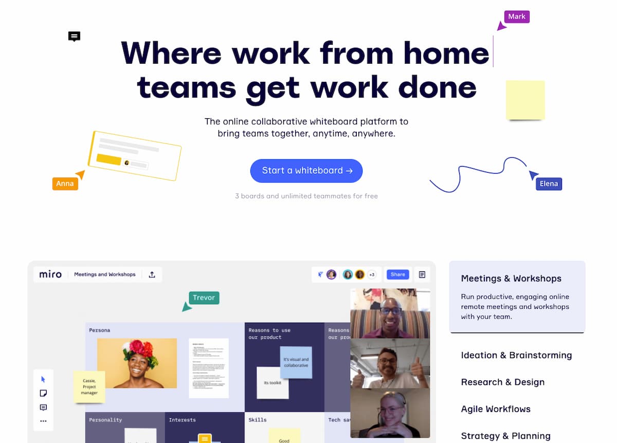

Here’s what you can take away from their page:
- The dynamic headline points out the different personas that could use Miro – distributed, remote, and telecommuting teams. If you’re one of them, you’ll keep scrolling.
- Use cases – right below the fold, you can see the platform’s most common use cases. You can see whether your idea or need matches what most users do with the platform.
- Education – new to remote work? Most of us are, and Miro understands that. That’s why they’ve doubled down to provide tons of educational content so that you can work – and use their platform – better.
Naturally, there’s more. You’ll find other usual stuff like testimonials, customer logos, and even information about how many users already signed up to the platform.
While this landing page is packed with more information than most of the other examples I’ve shared before, it’s an effective one.
The key reason is that Miro understands that meetings, workshops, and brainstorming sessions are all about creativity and collaboration. You don’t want to limit your attendees, but instead, you want them to go all out and share their ideas.
A minimalistic landing page design could have hinted that “less” is more appreciated, and it’s better to keep the information and exchange of ideas to the minimum.
15. SEOBlueprint
If you’ve been doing content marketing and SEO for some time, you know it can be disheartening.
Sure, getting your website to rank high in Google isn’t necessarily rocket science. Still, the abundance of information on the web makes it seem more complicated than it should be (not talking about technical SEO here).
So if you’ve finally decided to educate yourself around SEO and stumbled upon SEO Blueprint, you’ll quickly take away from their landing page that you’re in the right place.


And here’s how their page’s design and individual elements reinforce that feeling:
- The headline is written in the first person that repeats what many of us have been thinking.
- Logos of just a few, but very well-known brands (e.g., The Telegraph), that have succeeded in SEO and turn out to have taken the course.
- Testimonials from well-respected folks in the SEO world (Steve Toth, Bill King, etc.)
- Neat FAQ section that answers all your questions
- Waiting list – oh yeah, the course isn’t available throughout the year. It only opens up once in a while, and the chances are that you’ve visited the page when you couldn’t just hit sign up now.
- Even more social proof from Twitter and Facebook.
An excellent addition is their live chat that appears as you spend some time on the page.
It helps you get in touch with them right away and shows that SEOBlueprint cares about their audience, and offers a real person to answer any further questions you may have.
Best landing page examples – yours can be next
Building a landing page that converts well is no mean feat – even for the pros.
And, there’s no perfect landing page. However, there are some common threads you’ll find in the best landing pages.
Use these 15 landing page examples to benchmark for your next landing page and convert hard-won traffic into revenue.
Once you’ve crafted your landing page, you can carry out an A/B test that’ll split your traffic and help you pick the winning variant (one that achieves higher conversion rate) of your page.
If you want to try your hand at designing a perfect landing page for your audience – and don’t have an intuitive tool to help you out – create your free GetResponse account today.
The GetResponse Landing Page Creator comes with 200+ prebuilt responsive landing page templates, advanced drag-and-drop editor, and AI capabilities that can create a custom landing page just for you in moments.

But if you’d rather shop around, you’ll benefit from checking our thorough best landing page builders review.