A landing page is one of the most crucial tools in digital marketing. It plays a huge role in determining the overall success of your marketing efforts.
A well-designed landing page makes generating new leads and customers feel almost effortless. But unfortunately, creating such a landing page is no easy feat. From headlines, CTAs, copy, to navigation – the variables are just too many, and that’s why it’s so easy to mess up.
In this guide, I will give you the full anatomy of a high-converting landing page. I’ll take you through 9 landing page best practices and share some examples of top-performing landing pages.

What is a landing page and why do you need one?
A landing page is a unique website page designed with one specific goal in mind; to convert visitors into leads or customers. Think of all the links you’ve clicked from marketing emails and social and pay-per-click ads. They usually lead to a page that tries to convince you to trade your email address or sign up for a program in exchange for something valuable. Those are landing pages.
Why not use your homepage, though? Homepages are naturally designed to be the centerpiece of any website. They contain tons of links to different parts of the website. Therefore, the homepage is not very effective when you want a visitor to perform a specific action.
In contrast, a landing page has one sole goal. That means the risks of getting a visitor sidetracked are very low. Moreover, since the page focuses on only one goal, it leaves you with plenty of room to convince the website visitors of your value proposition.

Bonus: Learn how to create a landing page in 30 minutes or less with our free guide
The different types of landing pages
The choice of the landing page to use ultimately boils down to the goal you have in mind for your campaign, whether that is B2C or B2B content marketing. For instance, a landing page for converting website visitors to subscribers will be different from the one that’s aimed at closing a sale.
Learn more about the difference between landing pages and websites from our marketing podcast – Operation:Automation:
But that doesn’t mean a website can only have one landing page at a time. You can use multiple landing pages at different points of your funnel. That said, most of the key elements usually remain the same on all types of landing pages.
Here are the most common types of landing pages:
Lead capture page
The lead capture landing page aims to convert website visitors into leads. It contains a form where visitors can enter details like their names, email addresses, gender, etc. The visitors are usually offered something in return.
Keep a close eye on the amount of information your lead capture form is asking for. Keep your forms short if you target website visitors who are still at the top of the sales funnel. But if your target audience is lower in the funnel, you can add a few more fields in your forms.
Splash Page
A splash page is not your typical landing page in that it doesn’t aim to convert visitors into customers or leads. Instead, it’s used to convey a specific message.
You could use it to make an announcement or ask your visitors a question like their language preference or age before proceeding to another web page. For example, Ikea uses splash pages to ask visitors which version (language and location) of the website they want to access.
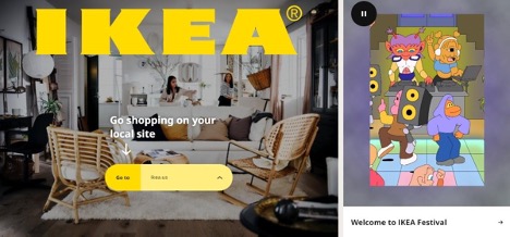
Splash pages are commonly used as an intermediary page for visitors coming from a social media post.
Sales page
As the name suggests, the sales page aims to convert visitors into paying customers. It is one of the hardest landing pages to create since you’re directly asking for the visitors’ money.

The perfect sales landing page addresses buyers’ objections as exhaustively as possible. And of course, it should only be used at the bottom of the funnel.
Thank you page
A “thank you” page works hand in hand with other landing pages. For example, you can link it to a sales page. That way, once the visitor has completed the desired action, they’ll end up on the thank you page.
But this type of landing page is not about showing your gratitude alone. You could also use it to push website visitors down the sales funnel.

A well-designed “thank you” page helps you get repeat customers or reaffirm new leads.
Coming soon page
A Coming soon landing page is primarily used to build hype around a new product. It can also be used to collect email addresses.

Adding a countdown timer boosts the effectiveness of this coming soon page even more.

9 best practices and examples for landing pages
Building landing pages is fairly easy. It’s also fairly cheap, thanks to modern AI-powered landing page builders. However, building a landing page with optimal conversion rates can be challenging. There are many factors at play here, and any of them could affect the user experience and tank your conversions.
Here are the key landing page best practices to help you build the best landing page for your needs:
1. Write enticing copy
Moz reports that only two out of every ten people read beyond the headline. The other eight check out the headline and bounce from the copy.
Your landing page won’t perform well if your target audience never reads beyond the headline. Therefore, you must write an engaging title that hooks your visitor’s attention. More importantly, it should tell the reader why they should scroll down the page and read your copy. You need to make a clear offer in your headline, then let the copy explain your offer.
Consider this example from Salesforce.

The copy works in various ways. First, the headline shows what the product can do for the customer. Second, the body copy invites the reader to know more. Third, the landing page uses social proof in the form of a client testimonial.
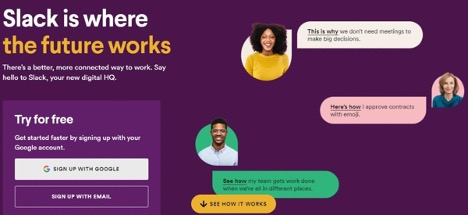
2. Include images or videos in your content
A good landing page contains at least one piece of visual content. The most basic reason is that images make web pages more engaging. Some studies also claim that the human brain processes visual content faster and better than text. However, that will only happen if you align the visual content with your offer and the images highlight your product.
Slack does an incredible job in its landing pages by explaining product features through animated images.
Besides images, you can also use short videos on your landing pages. For example, if you are trying to sell a piece of software, you can include a video discussing the features and benefits of your software:

The video from Keap above does not just explain the product. It does so with a touch of humor that keeps the viewer entertained while getting the message across.
3. Make your CTA stand out
The headline, visuals, and main copy in your landing page should all culminate in a super-effective call-to-action (CTA) button. It would be disappointing if you get everything right and slip up in the one place where visitors click to convert.
How do you create an effective CTA for landing pages? First, it should say what the reader is supposed to do. Do you want them to subscribe to an email list or register for a free trial? Use the appropriate verb to clarify the desired action.
Second, make the CTA concise yet meaningful. You can add a word or two to echo the value proposition. For example, instead of just saying “sign up” for a free trial software, use something like “Start your free trial”:

Next, your CTA button should stand out from the rest of the landing page. Using bigger buttons with colors that stand out from the background can help increase your click-throughs. Nevertheless, you need to A/B test multiple versions of your CTA until you find the perfect buttons for your audience.
Finally, you need to find the right place in the landing page for CTA placement. This shouldn’t be a big deal if you have a small landing page. However, for longer pages, you’ll need to place your CTA at strategic points throughout the page so it’s easier for users to find and click them.
4. Make the lead form visible above the fold
Most people click through to a landing page from ads or a marketing email. That means they’re already interested in what you have to offer. You need to capitalize on their interest and convert them as quickly as possible. Therefore, you need to place the form above the fold, where visitors can access it right away without scrolling down.
For instance, when you click through GetResponse PPC ads, you land on this landing page. The form field is accessible right away.

If your landing page is pretty long, consider designing a sticky lead form. This makes the form easily accessible, even for the users who are scrolling through the page.
Pro tip: If you’re unsure whether your signup form’s in the right place, consider using session-recording tools like Hotjar.
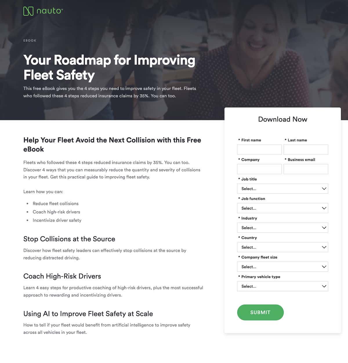
5. Offer something useful
The best-performing lead forms usually have a lead magnet. The magnet is something of value that would make visitors want to complete the desired action.
If you’re building an email list, asking for a visitor’s email address without offering anything in return is not very effective. What you should do instead is create something that informs your audience, such as a free ebook, webinar, or checklist. Just ask them to provide an email address and have it sent to their inbox free.
For instance, the landing page for security solutions provider Sophos offers a free copy of the Gartner Report for endpoint protection platforms:

The content of the Gartner Magic Quadrant report does not just contain a promotion for Sophos. Instead, it ranks different endpoint protection solutions according to different criteria and allows the reader to make an informed decision. Because Sophos was named a “leader” in the report, it is confident that the reader will eventually choose them for their security requirements – which is exactly what the company was going for in the first place.
💡 Read more: Inspiring webinar landing page examples

9 Best Ways to Drive Traffic to Your Landing Pages
Want to learn how to drive traffic to your landing page and promote it effectively? In this guide, we’ll share 9 effective ways you can do it – even if you’re not an expert.
6. Do not make excessive requests
Be very careful about the amount of information your forms ask for. Don’t make the mistake of requesting too much information in your landing pages. A long landing page form turns off prospects, and this will hurt your completion rate and conversions – as reported in the latest GetResponse Email Marketing Benchmarks report.

Also, remember people are generally wary of the amount of personal information they leave online. Asking for too many personal details in a landing page can easily scare away potential customers.
Keep your lead forms, especially those targeted to top of the funnel prospects, as brief as possible. The primary goal is to get the contact information. You can then ask for additional details down the road when the prospect is already engaged.

Liferay, for instance, asks for just three pieces of information in its landing page: the user’s email address, first name, last name, and location. This allows the company to add the user to its mailing list and sort them into a geographical segment right away.
7. Appeal to the user’s sense of urgency and use social proof
A consumer’s fear of missing out (FOMO) is a very powerful emotion that vendors tap to boost their sales. According to Next Gen Personal Finance, a financial literacy nonprofit, as much as 60% of customers make purchases due to FOMO, most of them within 24 hours. Limited-time offers are an effective way to harness FOMO and increase your landing page conversion rates.
How do you use limited-time offers? It can be as simple as sending an email to remind the user that they only have a few hours left to enjoy lower prices on specific products. At the landing page level, you can add a real-time clock that counts down the hours, minutes, and seconds left for the user to get preferential rates:

The landing page from Pabbly above is a good example of a business harnessing FOMO to boost its conversion rate.
The landing page designer placed a countdown timer at the top of the page. As if that cue was not enough, the CTA button says “Buy Now” in capital letters. Both of these tactics are designed to convince the user to make a purchase — not later or tomorrow, but now.
Aside from using a limited-time offer, the landing page also uses social proof to spur the user into clicking on the button. The space beside the countdown timer contains trigger words such as “high demand” that imply that the product is something that the user should buy. The space below the CTA also contains social proof in the form of five-star reviews to convince the user that they are about to make a worthy purchase.
8. Make your landing page mobile-friendly
Mobile devices account for the majority of online searches. Chances are very high that most visitors will access your landing page through mobile devices. That’s part of the reason search engines consider the mobile-friendliness of websites during indexing and ranking. It’s also why any set of landing page best practices should also contain mobile optimization.
One way of optimizing your landing page for mobile devices is by making it super responsive. Make sure page load times are optimal, and all form fields are easy to fill. Landing page images, videos, and CTA buttons should also fit smaller screens properly and be easy to interact with.
This landing page below from the UC Berkeley Executive Education program is a good example of a mobile-friendly landing page:

The mobile landing page design above loads fast on mobile devices because it uses only one image. In addition, it’s easier to navigate because the user doesn’t have to scroll up and down or zoom in or out to find whatever they’re looking for. It also asks for just a few fields, which makes it less likely for the user to leave before they can click on “Download Brochure”.
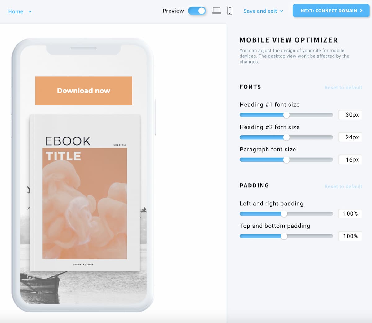
A mobile-optimized landing page is not that hard to build. In fact, most modern landing page builders can help you create mobile landing pages without much difficulty.
For example, here’s what the page mobile optimization options look like in GetResponse Website Builder:
9. Make search engine optimization a priority
Your landing page should be optimized for search engines even if you plan on using paid campaigns to drive traffic.
Start by optimizing your landing page for the right keywords. For example, if you want people to sign up for a free trial of a website builder, target the relevant keywords for such software. Tools like Keywords Everywhere and SEMrush can help you out with keyword research. Once you’ve identified the right target keywords, it’s time to incorporate them into your landing page content and meta description.
Next, give your visuals some alt tags. These provide your images with some context which is helpful for search engine crawlers.
Meta descriptions are also critical. The description appears under your link when your webpage appears in organic search results.

As you can see, this description provides more details about your product. The information can also help you get more landing page visitors.

Conclusion
Landing page optimization is an important aspect of digital marketing as it is often the point where a user decides to make a purchase or subscribe to your content. The marketing efforts and resources you invest paid and organic campaigns would mean very little if the landing page is not optimized for conversions.
Most landing pages fail because their designers do not optimize them to maximize conversions. They might think that landing page design follows the same principles as normal web page design, but our experience tells us that this isn’t the case. A landing page is designed to do one thing – get the user to click on the call to action button. If a landing page element doesn’t contribute towards that goal, it might be time to revisit its purpose.
The landing page best practices we’ve discussed above have helped businesses increase their conversion rates and increase their revenue over the years. Some of them, such as the use of FOMO and social proof, are not really new to marketers, but others, such as the use of mobile responsive landing pages, are relatively new.
The landing page optimization hacks we’ve shared will help improve your conversion rate, increase your revenue, and make your product visible to more visitors. That said, you should not overlook the importance of A/B testing. Use these split tests to analyze different elements of your landing page until you end up with the best-performing version.
Want to learn more about building the perfect landing page? In just over 8 minutes, we’ll show how you can do it with the power of AI using our GetResponse Landing Page Generator.