
Email marketing is one of the most reliable strategies to build long-term relationships with your target audience.
Typically, it involves sending newsletters to your email subscribers who consent through a signup form to receive your brand messages.
The only problem – the influx of personal and company newsletters has made website visitors wary of subscribing to new ones to avoid cluttering their inboxes with marketing messages.
How do you make irresistible opt-in forms for your visitors then?
A persuasive newsletter signup form with a compelling pitch about the unique benefits your newsletters offer is a great start. Layering it with some social proof and a clear call-to-action helps even further.
Learn more about newsletter signup forms’ best practices from our marketing podcast:
Let’s explore some newsletter signup form best practices with signup examples that are high-converting as well.
Why the right sidebar isn’t the best place for email signup forms
To fight information overload on the internet, web users have trained themselves to avoid anything that resembles an ad. Given that website creators have extensively used the right-hand sidebar of a web page (also called right-rail) to show ads, users now habitually avoid looking at this area.
Referred to as right-rail blindness, it means that anything too big or colorful (like the example below) is likely to be ignored.

Alternatively, NNgroup research recommends putting text links to relevant content in the right sidebar. Here’s an example from our blog’s homepage:

So if you’re putting a generic newsletter signup form in the right sidebar, don’t expect extraordinary conversion rates. Nerd Fitness tries to sweeten the subscription deal by offering a free ebook on 15 newbie mistakes in their right sidebar. But it’s flashy and susceptible to right-rail blindness:

If you’re in a competitive niche (such as marketing and software) where many businesses use email marketing, the right sidebar is even more likely to get ignored. For instance, data from six years ago by Devesh Khanal, a content marketer, found this sidebar converted at a dismal 0.3% for 100 views/month for a marketing blog he ran.

For a website with fewer visitors, you can expect better conversion rates. Khanal found his business blog converting between 0.4 to 1.2%.

See how to get more email opt-ins from your blog here.
Similarly, try to avoid putting opt-ins in places where ads usually appear – such as the top of the page – or in proximity with ads. Users have learned to ignore anything that resembles ads. This banner blindness behavioral tendency results in avoidance of the top banner area as visible in this heatmap fixations of 26 people:

If you go ahead using a feature box email opt-in (which appears in the top banner section), SmartBlogger shows a good way to do it. Blend it with your brand colors and your overall website style instead of trying to make it stand out.
Also, make a relevant offer. SmartBlogger offers a cheat sheet that could get beginner writers their first paycheck – useful and relevant for their target audience.

It also only appears on their blog page, thereby ensuring that other long-form posts on their website have a clean and uncluttered design.
Optimum newsletter signup form placements: Slide-in, floating triggered, and inline forms
Want some good starting points for experimenting with signup form placement?
Let’s go through some effective, less intrusive examples.
Speaking of examples, be sure to check out 10 Customizable Signup Form Examples for Easier Conversions!
Scott H. Young uses a slide-in signup form for new blog visitors with a persuasive pitch, “Learn Faster Achieve More.” It’s triggered once you scroll more than 50% through an article.

Test the optimum scroll percentage for your audience. A new visitor should spend some time engaging with your content before your signup form appears.
You can also create newsletter signup forms that slide in from the left sidebar. Here’s Tim Ferriss using it on his blog by pitching it as “exclusive member content”:

Inline opt-ins inside your blog posts would normally convert the best – especially if you offer a relevant upgrade to the current article. Here’s a SmartBlogger post on “Sensory Words” in which they provide a handy PDF download to their audience in exchange for their email:

Other common placements for newsletter signup forms
Besides the sidebar and feature box, email opt-in forms can appear below every blog post. Generally, they tend to be straightforward without any freebie offered in exchange, as self-improvement blogger James Clear does below:

You can also lock content on your website and make it exclusively available to people who share their email. This would work better if your audience loves consuming your content, and you’re an established brand. Here’s another example from Ferriss, who does it on his blog for new visitors:

Some websites also use their site’s footer to place a signup form or a link to their newsletter landing pages. For example, SmartBlogger puts up a link to their landing page for a prerecorded webinar (referring to it as free training) for soliciting new signups.

You can also use a prominent button in your global website navigation (and make it sticky) for redirecting people to such landing page forms. Authority Hacker shows us how to do it:

Many of the above signup form placements may not convert the best, especially if you don’t have a relevant offer. But they still can get at least a handful of new subscribers. For instance, I use a simple signup form for my article on the subject “How to make money on YouTube.”

Yet it has landed me a few subscribers:

Next, let’s discuss the most effective – yet dreadful – placement for newsletter signup forms.
Handling this annoying, but high-converting signup form with panache: popup
A popup form is typically effective at converting prospects, but it could be intrusive and annoying. When a new visitor lands on your site, immediately showing email signup forms in their face will be a huge turnoff.
Even if you delay the popup form, don’t shame the reader for refusing to subscribe. If you create passive-aggressive popup forms, they will earn you bad press and negative word of mouth:

The correct way to do it? Get creative (and authentic) while using them.
“No one likes popups.”
That’s the first sentence of the popup opt-in form used by the site Wait But Why at a few places on their blog. By being honest, then layering some humor to set expectations about their newsletter, the website does a great job with their signup form. Here’s how it looks:

You can also consider making popups interactive by conducting quizzes for getting emails of subscribers, like I Will Teach You To Be Rich does with their readers.

Ben Sailer at CoSchedule shares their popup strategy, “We have a few different options that direct to different product lines, depending on what we think a reader might be most interested in and on the topic of the page they’re visiting.”
He continues on how the company relies on data for their implementation. “We’ve done some extensive testing to refine our frequency to maximize their conversion rate,” he said, “and while there is some controversy in the industry as to whether they’re a good practice, we allow our data to guide us toward how to best implement them on our site.”
He recommends, “testing everything they can with their own popups (design, copy, offers, frequency, placement, everything)” to find what works for your website and blog.
Read more to learn how to create popups with ease.
Sorry, but potential subscribers don’t care about your “new updates”
Given the competitive email marketing landscape, assume that a potential subscriber is already on various email lists. “Getting new updates” from you isn’t on their agenda. Let’s explore a few different scenarios and signup forms that demonstrate the unique value of their newsletters.
If you publish news and time-sensitive content, consider highlighting the unique value that you’ll offer.
The Hustle’s homepage delivers a compelling pitch for its audience: “business and tech in 5 minutes or less.” The signup page is concise and clear. Their call to action button isn’t the vanilla “Sign me up”, either. Instead, it uses the action verb “join” and clarifies that their newsletter is free.
There’s also an option for readers to choose to get updates on market opportunities (which is their community and info service).

The company shares some social proof if you scroll below: 1.5M+ readers and testimonials to convince a prospect to subscribe.

The company’s newsletter opt-in below every article is concise, persuasive, and blends in social proof. It makes website visitors comfortable in sharing their personal information.

Incentivize sign ups for your newsletter with lead magnets
If you’ve been publishing evergreen content for a while, you might have a vault of top-performing articles that your audience loves. Consider repurposing them into downloadable lead magnets and offering them to your audience for free to collect their information.
Alternatively, create a dedicated resource relevant to your audience. They should find it valuable enough to share their contact information with you. Proving an immediate value for filling your newsletter signup form will compel more of your site visitors to subscribe.
For instance, Louis Grenier offers an 8-lesson video course on his website Everybody Hates Marketers.

Michal Leszczynski shares more lead magnet ideas and examples to take inspiration from. Here’s a table summarizing the content types and examples you can pick from:

In a survey of 790 marketers, GetResponse found that short-form videos and written content tend to convert the best. So they are good starting points but experiment with other formats to find what works best for your business and audience.

Create content upgrades to persuade more potential subscribers to sign up
Relevance is the key to building a high-converting lead capture form. Content upgrades are crafted specifically for a specific blog post, making it highly context relevant and useful to your website visitors.
For example, in their article on content marketing trends, Wistia offers readers an option to watch an on-demand webinar on the same subject. Many readers would find this lead magnet appealing:

But you might say, “It’s a lot of effort to create an upgrade for every blog post.”
So you have two options:
1. While it may not convert as well as exclusively created upgrades, you can offer a PDF version of your blog post like Uscreen.tv does below. It’s as simple as a content upgrade can get.

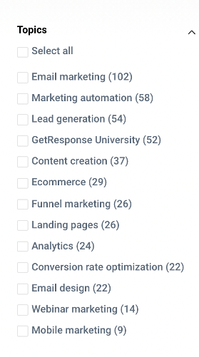
2. You can also consider creating broader resources that are valid for the major subtopics on your website. For GetResponse, these could be the ones listed on the left sidebar of their resources page:
Any route you take, prioritize creating such dedicated magnets for the articles where you’re already getting a decent amount of high-intent traffic. Your efforts should lend you a good enough number of new subscribers.
Do you know that GetResponse lets you create lead magnet funnels that automatically send the files you create to the people who opt-in to your list? Process streamlined!

Offer discounts on your products to incentivize email signups
If you’re an ecommerce business owner, your newsletter signup form could incentivize visitors with a discount, free shipping on the first purchase (if you sell physical products), or other special promotions.
For instance, Mizzen and Main reward $15 off $150 on the first order to the “Insiders” who subscribe to their email list.

Given that consumers love discounts from brands (145.3M users are projected to use them in the US in 2021), offering special deals on your products can work. For example, Salt Strong, an online saltwater fishing club, offers free lures to its readers (just covering the shipping charges) who subscribe to their blog.

CMI also lets people subscribe to their dedicated email campaigns if they want discounts related to their events.

Don’t have a product or your own? Then consider offering exclusive deals on products relevant to your audience. In an article about, for example, how to start an author blog, you can give web hosting discount coupons to those who subscribe.
Instead of creating a separate list, you can use segmentation and tagging to organize a single email list.
Note: Discounts can attract people who aren’t interested in your newsletter and content, but just “free stuff.” Ensure that you don’t devalue your products and offerings by offering heavy discounts. If you can offer deals on third-party products, choose the ones most relevant to your niche audience as possible.
How many form fields are too many for signup forms?
MarketingProfs, a leading B2B publication, doesn’t let its visitors read articles in full without subscribing to their newsletter first.
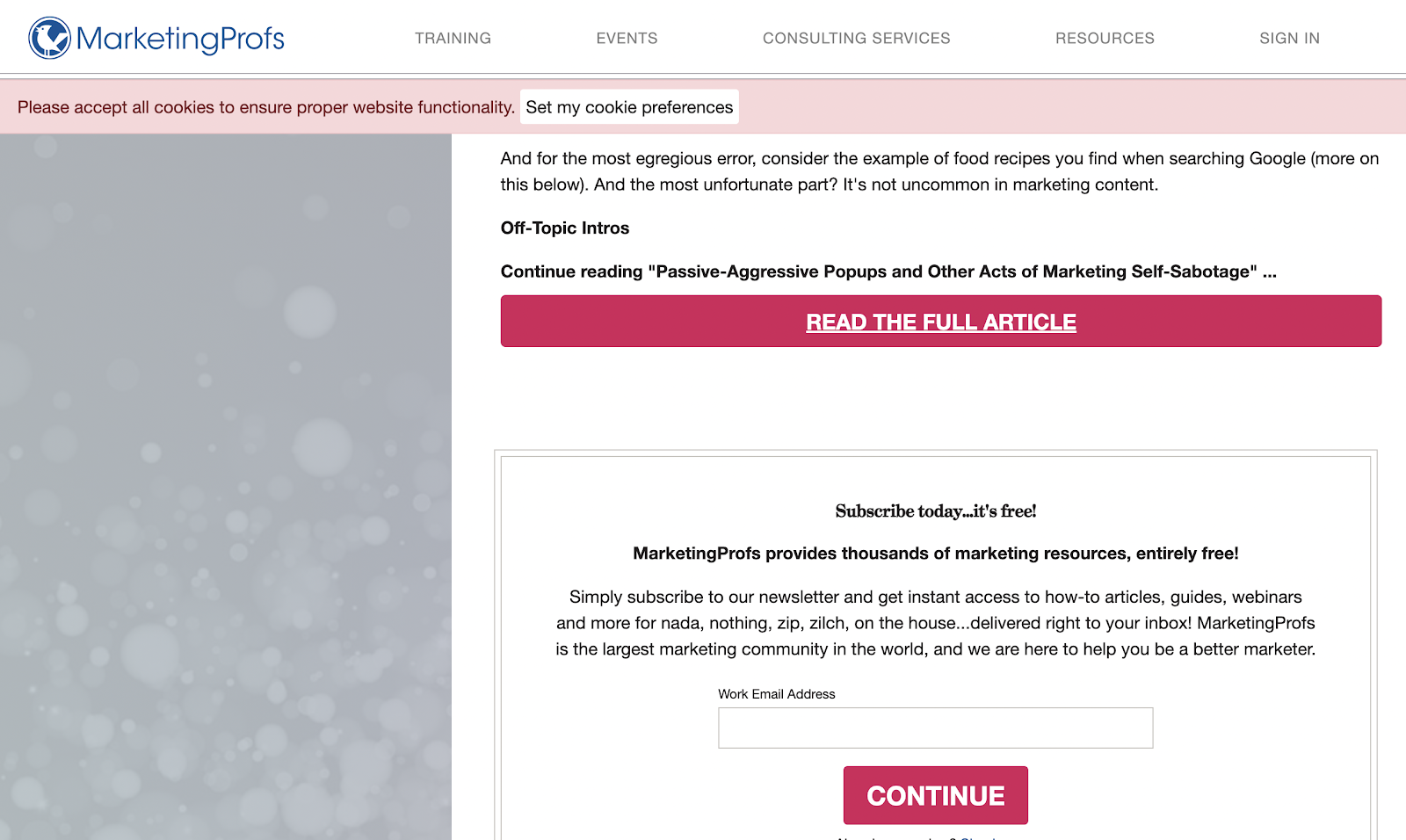
When you enter your work email, their signup process asks you to fill five more form fields and check two checkboxes (as shown below):

Aren’t more form fields supposed to drop conversion rates?

Well, automated emails triggered by subscriber behavior tend to get the highest engagement. For personalizing your content and ensuring that your email marketing efforts are relevant to your audience, you need to know them better.
Depending on your business and the goal of your email campaigns, it might make sense to dial up (or down) the number of fields. Only prospects genuinely interested in your brand are likely to share more of their data with you. They will also be more engaged, high-quality readers of your content later on.
As MarketingProfs offers high-end consulting and training services, casting a wide net of subscribers is not essential to their business. Instead, they collect more information to know their prospects better so that they have an idea if any of their paid offerings might work for them.
On the other hand, if you want to reach a large audience and build social proof, lowering the number of fields might make sense for your email marketing strategy.
Tim Ferriss, for instance, runs a personal media brand that relies on sponsorships, where reach and subscribers are an important metric for securing deals. So he maximizes the number of email signup form placements on his website, merely asking for people’s emails:

Should you use double opt-in signup forms?
A similar argument also runs for using a single opt-in vs. double opt-in. GetResponse benchmarks revealed that many industries are opting for the former. However, it results in a drop in the quality of customer data and even lowers your deliverability.
A double opt-in signup form shows you care about the consent of customers and is more probable to work better in the long term.
Respect the privacy of your prospects and customers
To build trust with your audience when collecting personal information, you need to share how you plan to use their info. Respecting user privacy and complying with the regulations in the country where you’re conducting business is essential to your email marketing success.
For instance, Content Marketing Institute (CMI) offers an ebook with a message indicating that they can opt out of their email list any time, a link to their privacy policy, and an unsubscribe button to comply with GDPR.

Whether you’re asking for information worth one form field or more, caring about and protecting your audiences’ data is key to the longevity of your business.
Set expectations about your newsletter
Your newsletter signup copy needs to establish what a new subscriber should expect from your emails. What kind of content will it contain? How often and when can your audience expect to hear from you? Here are a few ways to set the tone for your website visitors:
Offer a sample from your newsletter archive
Do you offer unique and exclusive email content in your newsletter? Then let your new newsletter opt-in page visitors get a taste of a few previous versions as it can lend you more subscribers. Here’s Rochi Zalani sharing a few of her last newsletters alongside her opt-in form:

Use social proof
Often bloggers and content-focused businesses use testimonials from their subscribers to demonstrate the value of their newsletter. Even as a product company, you can use a few such testimonials on your newsletter landing page to build trust with your audience.
Seeing you in the company of other brands can often spark signups – even from those who were initially skeptical. Here’s Close, a sales CRM, using testimonials from a few of their weekly sales newsletter subscribers:

Send links to your top content in your welcome email
The welcome email typically has the highest open rate before engagement starts to dip. So make a strong first impression through your kickback emails. As soon as a prospect signs up for your newsletter, share links to some of your best content. It will keep them excited to receive your updates and kick the relationship off on the right foot.
Email signup form best practices: Summary
Take inspiration from the newsletter signup examples I shared and use the tips in this article as a starting point. But best practices will only take you so far. Take your business and audience into account to find the right mix of elements for your email signup form.
If you’re experiencing low open rates despite optimizing email campaigns, then your messages might be ending up in the spam folder. And it’s probably time to change your email service provider.
Finally, here are some other placements to experiment with for your newsletter signup form:
About page – Relevant especially for bloggers and media businesses, your about page could be an effective way to get an audience interested in knowing more about you to subscribe to your email list.
Your email signature – If your job involves outreaching new prospects (not already on your email list) during your workweek, then try putting a link to your signup page at the end of your messages.
Your social media profile links – LinkedIn, Twitter, Instagram, and most social media platforms let you add your website to your profile. Putting your newsletter landing page here could turn your followers into email subscribers.
Now that you’ve mastered the best practices for signup forms, you can create a free popup with a signup form in GetResponse. Give it a try!
Which email signup form placements have you experimented with? Is there a specific signup form that converts better than others? Let us know in the comments below.