
Whether you’re new to email marketing or consider yourself an expert, you likely want the same: to send the best email marketing campaigns.
If you’re just getting started, read our email marketing basics and email marketing for small businesses guides first.
Already know your way around?
Read on and follow these 25 email marketing best practices that’ll keep your customers engaged, improve your ROI, and get your campaigns going in the years to come.
Email marketing best practices
- Send email campaigns using a custom domain
- Use a professional email marketing tool
- Use a memorable sender name
- Ditch the no-reply address
- Use confirmed opt-in
- Make unsubscribing easy
- Use the thank-you page strategically
- Segment your audience
- Send welcome emails
- Craft and test your email subject lines
- Use a matching preheader
- Pull people in with your header
- Drive click-throughs with engaging content
- Inspire action with your CTAs
- Make better use of the footer
- Make your emails skimmable
- Design emails for accessibility
- Test your emails before hitting send
- Send your email campaigns at the right time
- Pick the right email frequency
- Audit your communication regularly
- Focus on the right metrics
- Use lead magnets
- Use targeted popups
- Think about the whole marketing funnel
1. Send email campaigns using a custom domain
Want to build credibility and earn the trust of your target audience? Then the first thing you should do is ensure that you send your email marketing campaigns using a custom email domain.
While it’s easier to use a free email domain from Gmail or Yahoo!, mailbox providers will soon start to reject and filter out marketing messages (as per their recent announcement) where the sender cannot be easily identified or connected to a business.
On the other hand, if you use a custom domain, you’ll be able to build a stronger sender reputation and have a greater chance of landing in your subscribers’ inboxes. And the more people see your emails, the more opportunities you’ll have to generate a positive ROI from your email marketing program.

Read on to learn more about using custom domains for email marketing and find out why it’s essential to authenticate your email domains with SPF, DKIM, and DMARC, too.
2. Use a professional email marketing tool
You might be tempted to run email marketing campaigns using tools like Outlook or Apple Mail, but I’d advise against it. They may be free, but their service is limited, and they’re bad for your deliverability.
Email marketing tools like GetResponse help you not only to make your emails pretty (with free mobile-responsive templates and features like the Email Creator) but also help you build and segment your email list, automate your communication, and keep track of your campaigns. Don’t forget you can also rely on AI in email marketing for achieving the best results!
They also help you manage your deliverability by automatically handling bounces, complaints, and unsubscribes and working with Internet Service Providers to ensure your marketing communication is secure. Read on to learn more about the role of ESPs in email deliverability, and check our list of best newsletter software tools.
3. Use a memorable sender name
“You never get a second chance to make a first impression” Adam Grant
If your email doesn’t stand out and build trust, your subscribers probably won’t bother opening it. And if they ignore your newsletters a few times, your future campaigns may suffer and go straight to junk.
A recognizable and memorable sender name can help you avoid that. While it’s important to ensure you are delivering value to your audience, it’s also crucial to offer them a consistent experience with your brand.
Below I’ve gathered some of the most popular sender name formats companies use for their emails. Since no study has ever shown that one of these variants works better than the other, I suggest you pick a few that work best with your brand guidelines, test them, and stick to the one that works best.
- [Brand Name]
- [Employee Name] from [Brand Name]
- [Employee Name] @ [Brand Name]
- [Brand Name] Customer Support
- [Brand Name] Newsletter
- [Brand Name] Digest
Keep in mind that for B2B emails, you may want to go for a more formal tone, e.g., [Brand Name]. And if you’re a solopreneur with a strong personal brand, you may be better off using [Employee Name] from [Brand Name] or simply [Employee Name].

4. Ditch the noreply@ address
The noreply@ addresses is a little ironic.
Most marketers will swear their customers are at the center of their business. That they care about their opinions and feedback, both positive and negative.
And then, after earning their trust and convincing them to complete an opt-in form, they use an email address that straight-out says: “We don’t care enough about you to check this inbox.”
I get it. The sheer volume of auto-reply and out of office messages can often be overwhelming. And sometimes your email doesn’t seem like something people will respond to.
But your customers might see things differently. Don’t make it harder for them to give feedback. You probably have business profiles on Twitter, Facebook, and LinkedIn – all to be where your customers are. And to be available.
It’s the same with email marketing.
Who knows, maybe those who care enough to hit reply will be your best brand ambassadors.
The benefits of ditching the noreply@ address outweigh the negatives.

5. Use confirmed opt-in
Whenever I talk about good email practices, I always say email list quality beats quantity.
But I meet many marketers who are scared to use confirmed opt-in.
And I get it. They’re afraid of losing a potential client just because someone didn’t bother to check their inbox and click the confirmation link.

But the truth is, there are many ways you can increase the percentage of people who confirm your subscription (see tip #7). Plus, those who click on the verification emails tend to present much higher engagement rates. And engagement and conversions are what typically drives your business, not the size of your email list.
Read on to learn more about when it’s good to use double opt-in.
6. Make unsubscribing easy
As an email marketer, one of your main goals is to grow your email list. And while you’re investing a lot of time and resources into getting people to sign up for your emails, you also need to understand that they may unsubscribe at some point.
There may be many reasons for this. For example, they no longer can use your services because they moved to a new location. Or they already bought a similar product elsewhere. Whatever the reason is, there’s no point in holding a grudge and forcing people to stay on your list.
By making the unsubscribe process difficult, you’re risking:
- best-case scenario: they’ll ignore your emails or move them to a folder they never open
- worst-case scenario: they’ll report your emails as spam
Both of these outcomes lead to bad deliverability and lower return from your email marketing campaigns.
So here are a few pointers that’ll help you ensure your unsubscribe process is easy:
- Don’t require your subscribers to log into your app to unsubscribe, as they may have lost their access to it
- Tell your subscribers why they’re receiving your emails in the first place, for example, in your emails’ footer or the unsubscribe page
- Provide a one or two-click unsubscribe process through a hyperlink in your message footer
- Use a common phrase like “Unsubscribe” as your hyperlink text so people can quickly find it in the message
- Make the unsubscribe link big enough so that people using mobile devices will be able to click on it easily
- Avoid using dark patterns or tricky copy on the unsubscribe page
And by all means, don’t hide or push your unsubscribe link down this far from your email content:

7. Use the thank-you page strategically
What do you want your users to do after filling out your subscription form?
Do you want them to get used to opening your emails? Perhaps even mark you as the safe sender? Or maybe you want them to visit your blog instead?
Your thank you page can help you achieve all that. That is, if you use it strategically.
Think of it this way:
The user has just given you a direct hint they trust you and want to receive content from you. It’d be unwise to waste that opportunity and offer them nothing in exchange.
As you can see from the following two examples, your thank you pages can do a lot of good for you.
They can help you increase your deliverability and open rates. They can also help you drive traffic to your most important pages. Not to mention the fact they can increase your conversions.


Read this post if you’d like to learn more about how to create the perfect thank you page.
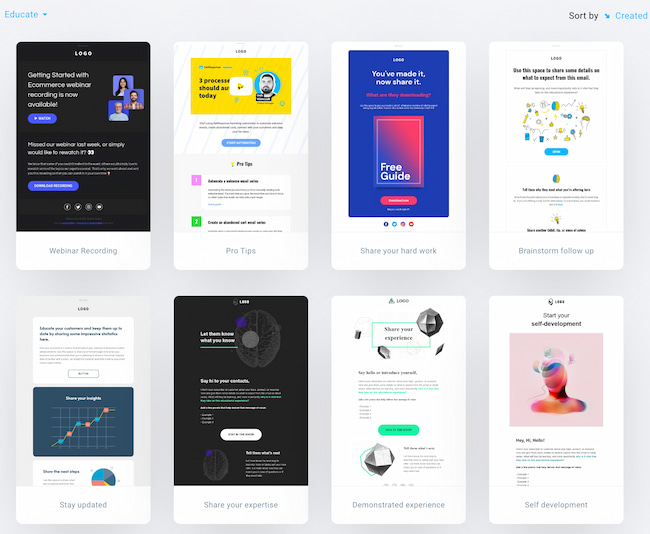
8. Segment your audience
Sending an email blast to your entire list may work from time to time.
But your chances of generating sales with your email campaigns are the highest when you create personalized content designed for individual customer segments.
You surely have heard about the Pareto rule. 20% of your customers generate 80% of your sales revenue.
Hard to believe? Then don’t take my word for it. Just verify it.
Identify the key segments, e.g., your most engaged subscribers or those with high RFM scores, see how much revenue they’re generating, and target them with your email campaigns separately.
If you can’t find these customers, stick to the segments you can think of right at the top of your head (the chances are you know your audience so well you’ll identify the best segments without additional research.)

If you need more inspiration and guidance, we’ve written this robust guide to email list segmentation and talk about ecommerce-specific segments in our ecommerce email marketing guide.
9. Send welcome emails
The welcome email is the single most effective message you can send.
According to our latest data, average open rates soar above 68% – and click-through rates are around 16%.
Welcome emails also help keep your list clean and improve your email deliverability. If someone enters the wrong email address, the welcome email will generate a hard bounce. That then notifies your email provider to remove it from your list.
They also reassure your new email recipients that the signup worked and the information they want is on its way.
Plus, they help you connect with new subscribers. Offer something valuable or exclusive at the start of their journey and watch click-throughs rise.Explore inspiring welcome emails that set the standard.

10. Craft and test your email subject lines
Studies show up to 50% of subscribers decide to open a message based on the subject line.
It makes sense.
Setting aside those who open every email, your recipients will generally only see three things before they decide to open or ignore your message:
- Sender name
- Subject line
- Preheader
Depending on their email client and your own settings, they might also see filters and labels.
But given that the subject line is much longer than the sender name and preheader, it plays a big part in the action subscribers take.
So how do you write effective email titles? We actually have a detailed guide that talks about it – how to write great email subject lines. But let’s go over its main points here.
First of all, take time to craft them. Treat them as the most important element of your email campaign – which they are. Don’t leave it as an afterthought. Set aside time to A/B test your subject lines. And use data, not your gut feeling.

Be creative. Pull all the aces out of your copywriting sleeves. Use power words, questions, idioms, and other tactics that may move the needle for you. And always remember whom you’re contacting and to whom you want to deliver value.
11. Use a matching preheader
Do you remember we said the sender name, subject line, and preheader are the first things subscribers see (the so-called envelope)?
Even if half your subscribers open your message on the subject line alone, the rest are swayed by other things.
While they’ll likely see the sender name first, the preheader still plays a part.
This is especially the case for email campaigns with shorter subject lines, since the preheader will take up more space.
The preheader can enhance your email subject line and increase your open rates.
In fact, our data shows messages with preheaders have average open rates of around 25.83%.
That’s almost 6 percentage points more than emails without preheaders.
Yet surprisingly, only 26% of messages have one.
That’s a missed opportunity.
Take a look at these examples:
Email subject line: Drop Everything. Sitewide Sale. Now.
Preheader text: It’s our birthday 🎉 Sitewide Sale + Free Shipping & Returns to celebrate!
Subject line: It’s now or never!
Preheader: Only 8 hours left on these Cyber Monday deals
See how the preheaders add more information to sway someone to open up?
12. Pull people in with your header
Getting people to open your email is just the first step.
In order to get them to click through your offer, you need to pull them in and get them to scroll through your message.
A great way of doing this is by making good use of the above the fold section, mainly your header.
Take a look at this email header from Exploding Kittens.

It clearly stands out. Most of our emails don’t look like a cartoon, so it catches our attention right away.
And there’s more. The cat in the picture wants to say something to us, but we won’t know what until we scroll further down.
So, what do we do? If we’re in that kind of humor, then we definitely scroll further down and learn about their offer.
Of course, this kind of informal approach won’t work for every brand, but I think you get the idea.
The email header needs to get people hooked on your email. It needs to capture their attention and convince them to keep scrolling down.
Pro tip: Keep in mind, most email headers contain a call to action link, and that’s what you should do, too.
From our experience, most email recipients click on the first button they see in the email (especially in ecommerce marketing) and continue their journey on your website.
So make sure always to add that hyperlink to your header image and drive people to your website.
Related:
1. 10 best Mailchimp alternatives for 2023: free & paid
13. Drive click-throughs with engaging content
What’s so special about emails you consider click-worthy?
Looking at your favorite newsletters, you’ll probably find some common threads.
They either offer great products, interesting stories, thought-provoking articles, funny videos, or something else.
Ask your subscribers the same, and you’ll likely get many different answers.
But what are some common features?
Our data suggests emails with video observe above-average click-through rates. The same goes for emails with images, personalization, and preheaders.
But you’ll need to analyze your own email campaigns and see what worked well in the past.
If you haven’t tried videos, animated gifs, interactive content, personalization, or emojis, it might be time to give them a go.
It’s a cliché, but you have to get creative.Take this example of how to use interactive content in email campaigns from Email Uplers.

For inspiration, check out these great email marketing campaign examples.
14. Inspire action with your CTAs
When designing your emails, make sure recipients know what to do next.
Is it to register for a webinar? Download an ebook? Or maybe share your story with their network? Whatever it is, ask for it!
To do that, you’ll need email calls to action (CTA). These can be buttons or simple text – it’s best if you test them.
The fewer calls to action, the more attention they’ll get. You’ll also want to keep them visible and easily accessible – especially on smaller devices like mobile phones.
To make your calls to action more powerful, play around with the copy and elements around them.
For example, you could add a countdown timer or mention when the offer expires. Or add a testimonial for credibility.The good news is, there are many more ways to increase your click-through rate.


15. Make better use of the footer
Most email marketers use their email footer suboptimally.
They use it to provide all the legally required information, like the unsubscribe button or their company address, and that’s about it.
Yet, there’s so much more you could be doing with your footer. And it could be helping you drive more conversion, too.
Here’s an example from Magic Spoon that carries a promise of happiness.

And here’s another one, telling you more about the team behind the newsletter and even offering you a special promo.

Last but not least, here’s an email that reassures you that if you’re going to reply to this message, you’re going to reach a real person.

And there’s more you could add to your footer to drive conversion.
Here are a few more ideas you could include in your footer:
- A quote from your customer acting as a social proof
- Logos of the sites that featured you
- Your unique selling proposition, like a 100% money-back guarantee or worldwide free returns
- Option to review your message
- Results of your latest newsletter giveaway
16. Make your emails skimmable
We’re all busy people these days. We’re also being distracted by different things, people, and marketing messages every single moment.
That’s why if you want your emails to convert better, you need to make sure to communicate your message as quickly as possible.
Structure your content in a way that makes it easy to read and understand.
Use bullet points, headlines, lists, and the preheader text to clearly and quickly state your main message.
If you do it well, you’ll likely see an increase in your email engagement metrics, like the click-to-open rates.
Here’s one brand I know that does this well.

You don’t need to scroll below the fold to understand the offer. In that one sentence, presented in a highly visible place, they’ve covered everything that matters.
This approach saves the subscriber’s time – they can move along if they’re not interested – and lets the brand quickly capture the attention of those who are in the buying mood.
17. Design emails for accessibility
It’s easy to forget you have a diverse audience.
Serving them goes beyond simple segmentation and personalization. You also want to make sure your marketing messages are accessible.
According to World Health Organization, over 2.2 billion people live with some form of visual impairment.
Odds are, some of your subscribers do too.
Here are some ways to make your emails more accessible:
- Use appropriate font size, 14-16px for main text content
- Use appropriate contrast and test it with WebAIM Contrast Checker
- Keep a reasonable amount of negative space around your content
- Structure your content well
- Avoid jargon or complex wording
- Provide ALT text in your images
You’ll find more tips like this in our email design best practices guide and this email accessibility guide we co-wrote with our partner, Email Uplers.
18. Test your emails before hitting send
We’ve all seen emails with broken subject lines, images, or inaccurate personalization.
The ones that call you Emma when your name is Bob. The ones that say you’d look great in a dress when you prefer cargo shorts. Or the ones that are so broken you don’t know where to look.
But all of these mistakes can be avoided. Take the time to preview your emails in popular email clients, ensure they won’t land in the junk folder with a Spam Checker, and send the message to yourself – before it reaches your entire list.It’s easy and only takes a few minutes. And in GetResponse, you can use the Email Maker to run an Inbox preview and Spack check test in just a few clicks:


It pays to double-check your emails for silly mistakes.
Of course, you might mess up on purpose as a stunt or joke. Just make sure it’s a good one – and don’t do it too often!
19. Send your email campaigns at the right time
Every email marketer wants their newsletter to be at the top of the inbox.
After all, most subscribers will pick the emails they see first.
So when should you send your emails?
Our latest study shows that the best time to send email is largely an individual thing. It varies across different locations, industries, and audiences.
The best practice is to send your emails using a send-time optimization algorithm like the GetResponse Perfect Timing. These tools adjust the send-time for each individual subscriber automatically, based on their previous behavior.
But if you can’t use send-time optimization algorithms, you’ll want to keep in mind the following results & most likely send your emails early in the morning.

Related: How to increase your email open rates
20. Pick the right email frequency
Another email marketing best practice is knowing how often you should contact your subscribers. And that can be a tricky task.
If we look at the mailing frequency data, we see that email marketers who send just one newsletter a week get the highest average open and click-through rates.
It’s a popular approach since 46% of all accounts we analyzed only send one newsletter a week. Bear in mind this data doesn’t exclude marketers who also send triggered emails or RSS emails.
What about other frequencies?
Around 19% send two newsletters per week, and 9% send three. Just 5.5% and 3.9% send four and five emails, respectively.

At the same time, since most marketers want to maximize their email campaign ROI, instead of average CTRs, we should look at the total number of conversions they generate.
Based on that assumption, you might be better off sending two or more emails in the same week. But to say for sure, we must take into account some other factors: extra revenue you’d make from sending an extra campaign, how many subscribers would leave your list after receiving too many messages, plus the cost to replace those leads.
Having said all this, the general best practice is that you should send at least one email per month and not more than one per day to your audience. Naturally, for some businesses or during specific times of the year (e.g., before Black Friday), you may increase your mailing frequency.
Read on to learn how you can establish the right mailing frequency for your business.
21. Audit your communication regularly
Automated email campaigns often get sold as something you can “set and forget.” That’s not entirely true.
What you put into your email communication isn’t always going to be evergreen. Your language, things you’re referencing, or images you’re using may all become not only outdated but also feel insulting or opportunistic.
With so many things happening in the world around us, we need to be careful about our messaging and how others can receive it.
So make auditing your automated email communication a standard procedure. Something that you do every quarter or two. This way, you’ll ensure that your messaging stays relevant, engaging, and most importantly – considerate. Your audience will value you for this and remain loyal to your brand.
22. Focus on the right metrics
What do you want to achieve with your email marketing campaigns?
Is it more opens or conversions? How about more revenue per email sent? You need to set the right objectives.
And if you’re reading these email campaigns best practices to improve your results – you should look at the right email KPIs.
Which ones? It depends on your goal.

The email open rate is often considered a vanity metric. The click-through rate is more actionable, but it still doesn’t tell you how much revenue your campaigns generate.
So it’s best to learn about all the key email marketing metrics and how to choose them to suit your objectives.
23. Use lead magnets
With more competition, building an email list isn’t as easy as it once was.
And that’s despite the fact that we know many effective ways to build an email list.
It’s not only challenging because your audience has far more information sources to choose from.
It’s also because some marketers have abused the privilege of getting into their subscribers’ inboxes. They’ve sent too many irrelevant, uninteresting, or (worse) misleading email campaigns.
That means website visitors might think twice before filling out a form. And, they’ll expect far more value in return for their email address.
It’s hard to prove your newsletter is worth it in a simple web form. But a lead magnet can be a great way to offer value upfront.
Lead magnets – also known as incentives, freebies, or ‘bribes’ – are the best way to overcome people’s hesitation.
It can be a downloadable ebook, special industry report, calendar, or another enticing giveaway.
Here are some more lead magnet ideas to inspire you.
Since there are so many to choose from, you’ll need to test them to see which one gets the biggest conversion rate.
Here’s a lead magnet we like

It’s a low-cost freebie, especially as there’s no guarantee to win.
But the value of winning is relatively high if you look at it from an individual user’s perspective.
What’s also interesting is these books probably don’t relate to the newsletter content. But they allow the business to position itself as an industry authority. And that’s a pretty smart marketing move.
24. Use targeted popups
Despite how you feel about them, popup forms are one of the most effective methods for building email lists.
The average conversion rate for a popup is around 3%. But if you’re willing to put in a little work, you can target your audience with laser-focus precision, achieving conversion rates above 5% or even 10%.
When building your web forms, ask yourself these questions before they go live:
- When should the web form appear?
- When should it be hidden?
- Should it be shown to the same user again, and if so, how often?
Since you don’t want to irritate your users, you’ll want to present your option forms only when it makes sense.
Sometimes that’ll be a few seconds after they’ve entered the page (rarely). Sometimes it’ll be after they’ve scrolled through 50-75% of your article (which may be a sign that they’re engaged), after a certain amount of time, or as they’re about to leave the page.

Learn more about how popups work and how to create a popup that converts.
25. Think about the whole marketing funnel
Not a single marketing channel can work on its own.
If you want to sell your products or services online, you need to have an audience. To have an audience to talk to, you need to build an email list. To do that, you need to create a landing page and drive traffic to it. Once you’ve done that, you need to offer them a lead magnet and nurture them after they’ve successfully signed up.
This process goes on and on, and it’s easy to get lost on the way.
That’s where marketing funnels come into play.
They’ll help you use your marketing channels together more effectively, keep track of your business objectives, and maximize your conversion rates.
Here’s an example of what kind of assets could go into your marketing funnel

The good news is that although marketing funnels may sound a bit intimidating at first, they’re pretty simple to set up.
Even simpler if you use a tool that helps you create them automatically.
Just like the GetResponse Conversion Funnel we recently announced.
Your next steps
You now know all our recommended email marketing best practices.
It’s time to apply them to your email marketing strategy and start driving more revenue.
Need a helping hand?
Then check out Email Marketing from GetResponse. Whether you’re trying to build an email list, send stunning emails, or optimize your email marketing program – we’ve got all the tools you’ll need to succeed.
Best of all? You can test them all for free.